CASE STUDY

Pennsylvania Academy of the Fine Arts

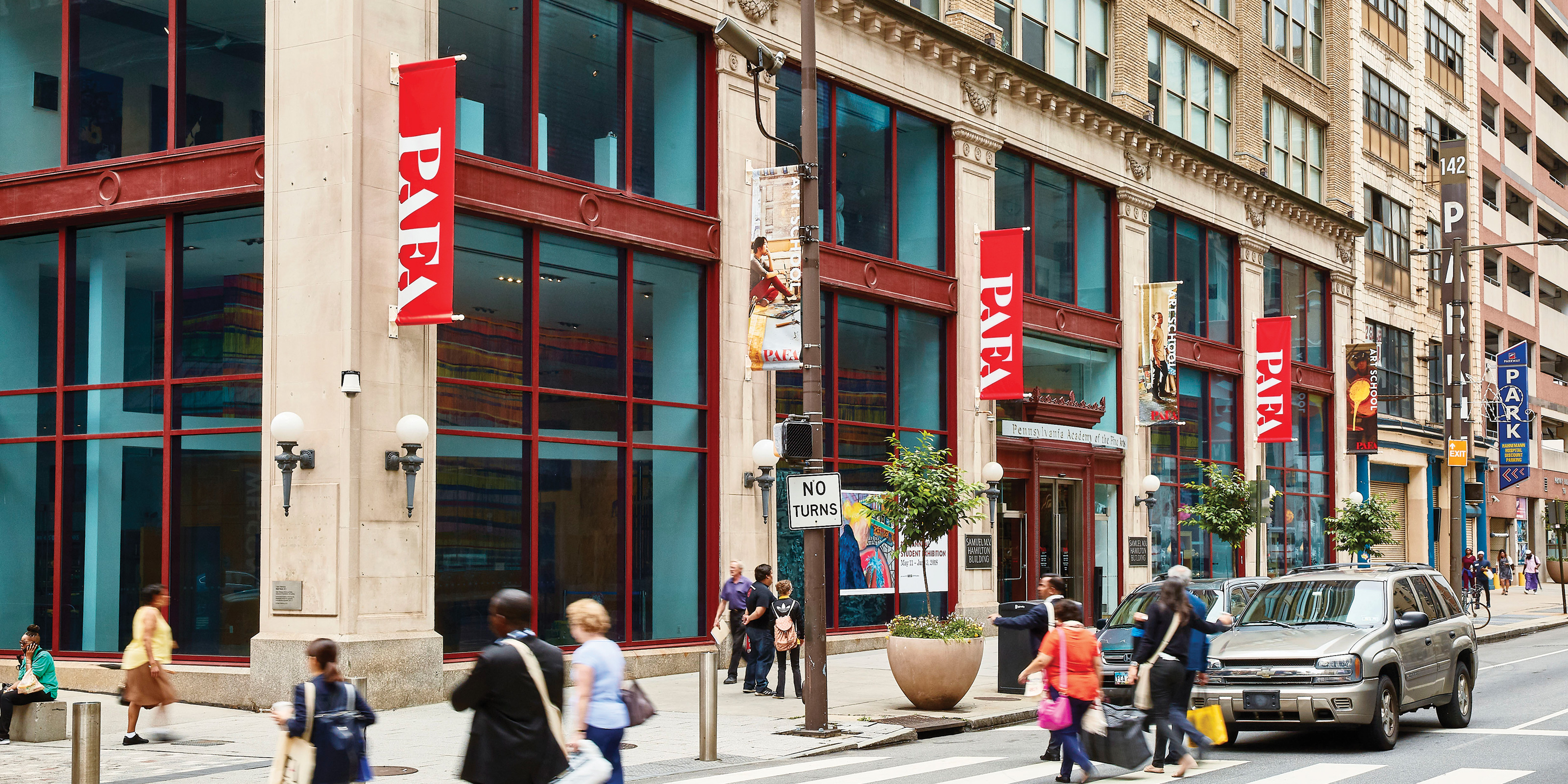
The Pennsylvania Academy of the Fine Arts is the oldest art school and museum in the country. PAFA sits right on North Broad Street, a few blocks from Philadelphia’s iconic City Hall and Claes Oldenburg’s Clothespin. And yet it remains a bit of a hidden gem. Not quite on the tourist footpath that takes visitors past the Art Museum stairs, The Barnes, or the Rodin, PAFA—as its affectionately known—was in need of a new graphic identity. PAFA specialty is American art and has been since our country’s founding. A new look for this storied institution must honor the past and pave the way for growth and expansion. 

  • The Heads of State has developed an exciting logo and graphic identity for us, with photographs that help us tell our story, and a signature palette and pacing. We are now much more adept at telling our story through images and typography that authentically reflect PAFA’s brand as the oldest art school and museum yet profoundly contemporary and progressive.
    David Brigham
    President, The Pennsylvania Academy of the Fine Arts

Process

The previous identity avoided focusing on the PAFA acronym. We felt a classic wordmark would be an opportunity for visual simplicity and increased name recognition. We investigated many options, with some borrowing historic elements from the building’s architect Frank Furness. Others attempted something utilitarian and plain and more akin to the “Workshop of the World” nickname bestowed upon 19th century Philadelphia. Many rounds and collaborative conversations with stakeholders led us to a stencil version of Butler, a Bodoni-esque poster typeface. Playing with gestalt and custom ligatures led us to the elegant and slightly military wordmark you see in this campaign, which also bears some resemblance to Robert Indiana’s famous sculpture in nearby LOVE Park. 

Results

The wordmark became the heart of a total overhaul of the visual identity and marketing collateral for the school and museum. Dozens of school and museum postcards and posters are issued every semester based on a collateral system anchored by the bold logo and refreshed brand typefaces. The redesign extended to a full signage and wayfinding campaign which includes flags on both the school and historic Frank Furness building. In September of 2018, a life-size logo sculpture was installed next to Claes Oldenburg’s giant paintbrush sculpture on campus at Lenfest Plaza.

Project Components

  • Ads & Collateral
  • Branding
  • copywriting
  • Signage
  • System Design